Jurassic Park: The Devils in the Desert
#1
Reviewed by Patrick Hayes aka PatBorg
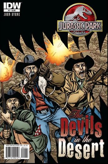
The covers: Three locals make a
valiant, though hopeless, stand against a
non-specific dinosaur and its jaws by John
Byrne. Isn't this what you want on a JP
cover? Action. Fear. And, most importantly,
what the hell is coming at them? The curiosity
factor compels you to open the book! Sharp
coloring on Cover A by interior colorist Ronda
Pattison helps: the browns are rightfully
overshadowed by the orange gunblasts, while the
clothes' colors don't draw your focus away from
the horror. I also like the logo for the
series: the fancy cursive western articles and
preposition combined with the windtorn nouns.
So pretty! Now if you'd like to see John Byrne
ou naturel, pick up the Cover R(etailer)
I(ncentive) for the same cover minus Pattison's
contributions, though the JP logo and
the series title are colorized. I like the
cover better with the colors. Overall
grades: Cover A A and RI A-.
The story: Byrne begins his
tale in an unnamed area of the American
Southwest. Young Tyler Franklin rides into
Sheriff Will Tobias's office because of cattle
mutilations on his father's ranch. The pair are
accompanied to the site with Deputy Daniel
Jackson and they find not a mutilation but
something closer to "run-off from a
slaughterhouse!" A trip to the Franklins' house
finds mother Sara Franklin waiting for her
husband's return. That's up to Page 4 and
that's as specific as I'm going to get. What
follows is some tracking, a past history
revealed, the cover scene, some federales and
scientists, and then a wowzer of an ending and a
tease. As a reader, you know what's going on,
but the joy comes in waiting for the characters
to find out. There's quite a bit off action off
camera, but this increases the tension, provides
opportunities for character development, and
contribute to a nice conclusion, which leaves
you wondering what else is out there?
Overall grade: A+
The art: John Byrne, again.
And, if you are unaware, he's good. Unlike
other comics, Byrne is sticking fairly rigidly
to four horizontal panels per page, giving each
panel a movie's letterbox feel to each image.
Only switchboarder Liz rates some
differentiation. This format never gets
stagnant because Byrne makes the camera of this
comic move about constantly. Page 3 is my
favorite: an establishment of the scope of the
carnage, a focus on the characters, a hint of
death, and then a close-up reaction too off
panel gore. I was also impressed that the art
hints at gore, more than showing it. JP
should be PG-13, and this book, so far, is PG.
But, then again, we're only one issue in.
What's not to love? Overall grade: A+
The colors: For a book set in a
desert this is a colorful comic. Ronda Pattison
does some wonderful skies, in day, at night, and
at dawn. I expect browns and yellows in this
setting, so much so that I expect the book to be
an earthy blur. The skies, the clothes, and the
cars all provide enough of a contrast to keep
this from happening. There's nothing gaudy
about the colors, they're real. I can think of
no better compliment. Overall grade: A+
The letters: A phone ringing
and dialogue are what Shawn Lee brings to the
table. Not much? Not so fast! As opposed to
just dialogue, certain words in characters'
speech are enlarged, bolded, almost italicized,
to provide emphasis. This aids the reader in
"hearing" each person's speech. I'm all for
this! Overall grade: A+
The final line: Jurassic Park
has moved to the desert and John Byrne has
opened the gates. The ride has just begun!
Overall grade: A+